What is SQL Endpoint?
"A SQL endpoint is a computation resource that lets you run SQL commands on data objects within Databricks SQL." From Microsoft.
As you
might know that now Databricks support three modes given below:
- Data Science
and Engineering
- Machine
Learning
- SQL
To create an SQL endpoint and dashboard you have to use SQL workspace.
Follow https://docs.microsoft.com/en-us/azure/databricks/sql/admin/sql-endpoints to create an SQL endpoint.
Scenario 1: I have got sales data in the source system and want to view the summary of the sales or return in Databricks Dashboard.
Scenario 2: I have got aggregated data in Delta format and wanted to expose it to the custom application (for instance C# desktop or web application).
To cover
both scenarios, I have got below is reference architecture from Databricks:
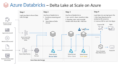
The above architecture is slightly changed as I am not using Azure Synapse Analytics as my serving layer instead I am exposing my Delta tables through SQL Endpoint and also I am not using a streaming dataset.
I am loading
data from source to all layers (raw lake to delta lake (bronze, silver, and gold).
The Gold layer contains the aggregated results (or summary).
If you want
to create the below-aggregated data in the Gold layer, simply run the below
code to a python notebook in the “Data Science and Engineering” workspace:
What are the components of the Dashboard?
The
Dashboard in Databricks is composed of the following two major components:
- . Visualizations
- . Text
The
Visualization component is based on the Query. So a query can have multiple
visualizations which can be used in the dashboard.
The text
component is where you can compose text using markdown. For instance, adding
graphics and information.
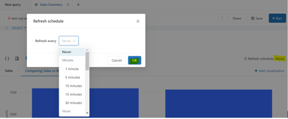
The query
has a schedule component that allows it to refresh the data shown in the
dashboard:
To me, the Query
and associated visualizations follow a publisher-subscriber model where the query
is the publisher, and all visualization is a subscriber. Any changes to query results
will reflect those changes to visualizations as well.

For
instance, if you have a streaming source that is constantly updating your
aggregated results then the query should have a scheduled component to refresh
it automatically as per your schedule.
There are
lots of visualizations like Bar chart, pie chart, counter etc. When you add a
visualization widget to the dashboard it asks you to select your query first
and then select your visualization associated with that query.
Now we
understood the Dashboard, let’s create a query called “Sales-summary” as shown
below:
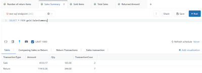
As you can
see I have used a very simple query (just select * …) the reason is that the
Gold layer is populated with complex queries (multiple joins and/or group by
etc) when we were loading data from Bronze to Silver and Silver to Gold.
You can
also see there are four visualizations (tabs in the above screenshot) associated
with the “Sales-Summary” query mentioned below:
- Table (which is
showing the results as a table)
- Comparing Sales
vs Return (It is a Bar chart)
- Return
Transaction (It is a counter showing the returned amount with formatting)
- Sales
Transaction (It is a counter)
I also
created two more queries to show items sold and items returned as counter visualization.
Now I have
got all my queries and associated visualizations ready, I can simply create a
Dashboard in the Dashboard collections named “Northwind Sales” and arranged my visualizations as shown below:
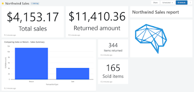
I also used
the Text component to place a MusoftTech logo and text with the help of
markdown.
You may be
thinking I have got more returns than sales and this is because my random number
generated more returns than the sale.
One of the
cool things is that each component of the Dashboard shows how fresh your data
is.
The
Dashboard can be refreshed based on configured schedule or it can manually be
refreshed as required and also it can be shared via email by subscribing the email address to the Dashboard.
For scenario
2, the Databricks SQL endpoint is used to expose the Delta tables. The Delta
tables can be consumed directly from PowerBI with SQL endpoint connection details.
I am going
to consume the Delta table from the C# console application which shows that it
can be consumed by any .net application. To connect your C# application to the
Databricks SQL endpoint you need to create System DSN or User DSN and you have
to install the ODBC driver.
Below is the screenshot of my DSN configuration screen:
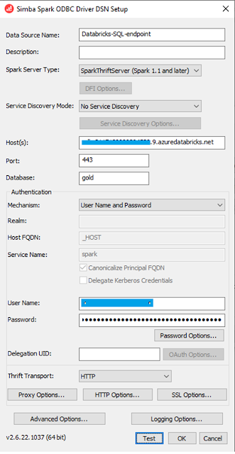
- Host(s) is your Databricks SQL endpoint host URL.
- User name is
your azure ad account
- Password is
your personal access token.
You also
need to set “HTTP Options” with the HTTP path for your endpoint and “SSL Option”
to tick on “SSL”.
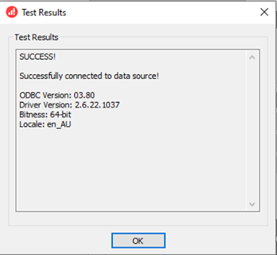
Once you
have provided all settings you can test the connectivity by clicking on the “Test”
button and the result will be shown below:
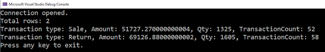
After testing
the connection I have used this DSN in my C# console app, like in the code is
given below:
and running the app would return the below result:
That’s it
for now.
Excellent post Muhammad! Thank you for sharing.
ReplyDeleteYour blog is incredible!
ReplyDelete